Data Visualization with FIORI and SAC – Part 2
1. Introduction
As stated in the previous Blog “Data Visualization with FIORI and SAC – Part 1”, we created a Fiori Overview Page based on S/4 data from a virtual CDS data model. In this one the analytical overview page will be re-created as SAP Analytics Cloud dashboard, as closely as possible, using the same source data model.
Based on this hands-on comparison, we will decide which tool pays off for which use case.
2. Implementation
2.1 Data Model
For SAC the Data Model is either coming from:
- SAP S/4HANA & SAP Business Warehouse (BW/4HANA): Real-time or imported data for core ERP/BI analytics.
- SAP HANA: Direct live connections for in-memory speed.
- SAP Datasphere: For modern data integration and modeling.
- SAP Business Planning and Consolidation (BPC), ByDesign, SuccessFactors, Concur, Salesforce: For planning, finance, HR, and CRM data.
OR Non-SAP & Other Sources
- Databases: SQL (JDBC/ODBC), Google BigQuery, Amazon S3.
- Cloud Services: Salesforce, Concur, SuccessFactors, Qualtrics, Dropbox, Google Drive.
- APIs: OData services for broad connectivity.
Connection Types
- Live Connection: Data stays in the source system; queries run live (e.g., SAP HANA, BW, S/4HANA).
- Import Connection: Data is copied into SAC for analysis and combining (batch processing).
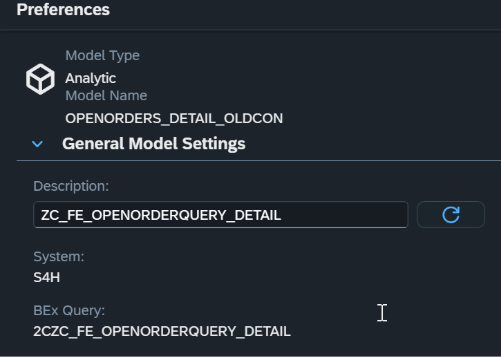
For the Visualization the used Data Model is the View Entity from the S4 Hana on premise system. The CDS view entity can be found in the S4H connection. Authorization for the data content is authorized within the source system plus the User would need Creator Privileges in SAC to create the model.
2.2 Dashboard
After the model creation, a SAC Story was created based on the layout from the Fiori Overview Page without scripting.
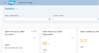
The first Card on the Fiori Overview Page is a list of Open Amount per Sales Document ranked per Open Amount. In contrast, for SAC the only way probably to use this card would be to create a custom widget, which was not focus of this comparison.
For this data visualization, the goal was to create a dashboard without any other effort.
So, for this reason, the dashboard starts with a bar chart sorted by Open Amount of course.
The rest of the widgets were easily added. Furthermore, all widgets are set for Linked Analysis for all widgets:
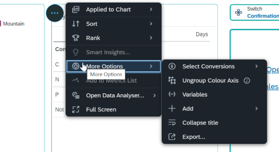
Options for Graph Widget
Options for Table Widget
On the right side of the dashboard, Hyperlinks are listed for various pages. From there the user can jump to the Fiori App and even to the Sales Order Transaction. Different widgets with different data points are created and formatted. Filters, Input-Controls etc are added for better navigation and data overview.
When jumping to the Fiori App, it is necessary to have authorization there too. Since Single-Sign-On does not work here, user must sign in before seeing the Fiori Apps.
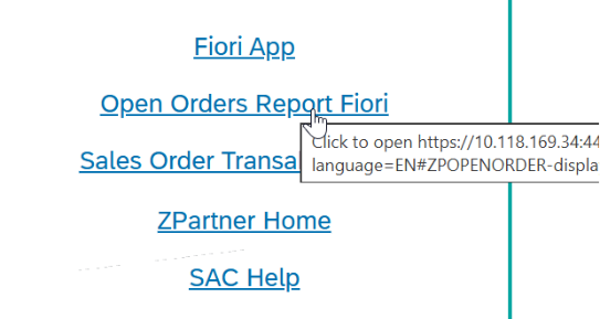
Click on the Link for Open Order Report Fiori
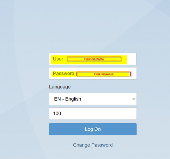
Enter User and Passwort to get to the Fiori App. Set-up the Hyperlink to open a new page cause if not it will open in the same page and going back from the Fiori App is not possible.
Open Order Fiori Overview Page opens
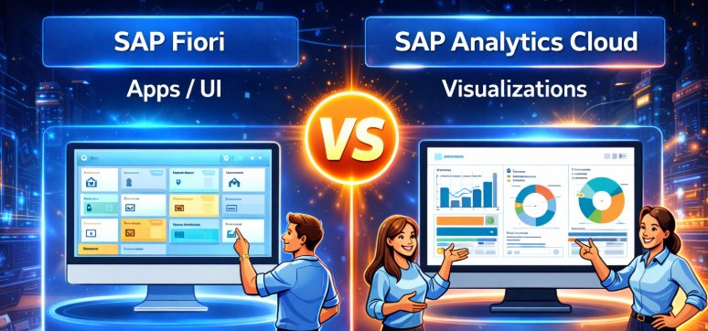
Target audience for SAC dashboards are mainly management whereas analysts should do their deeper analysis in the Data Analyzer.
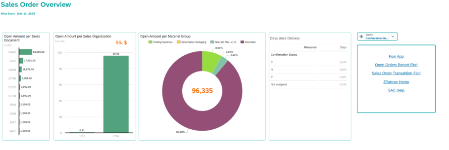
SAC Dashboard
Vs.
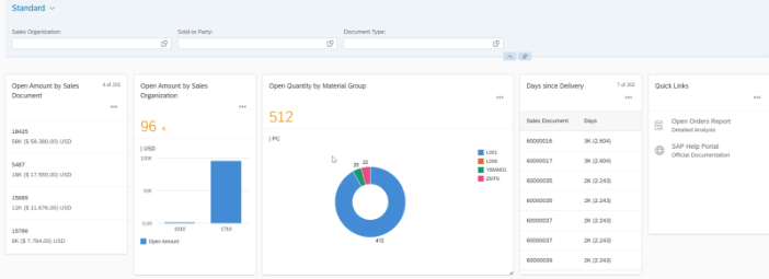
Fiori Overview Page
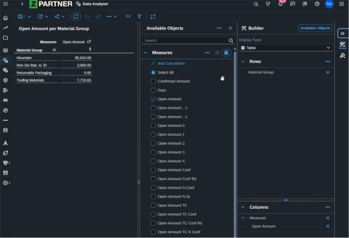
2.3 Data Analyzer
Data Analyzer is a predefined ready-to-run application for Live SAP BW queries, Live SAP HANA views, SAP Analytics Cloud models and SAP Datasphere models for ad-hoc analysis. A data analyses saved in the Data Analyzer is called: Insight
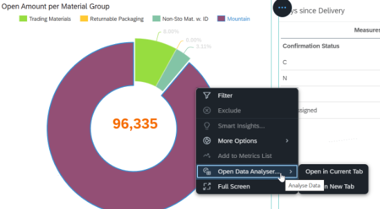
Data Analyzer can be launched from the navigation pane or from within a story via a widget.
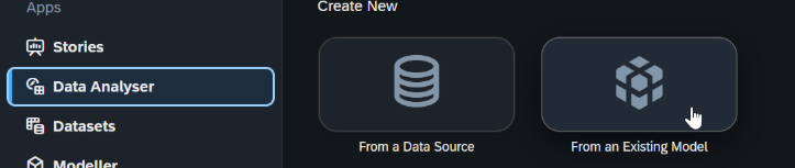
Launching the Analyzer from within the story on a widget has the advantage of selecting model and filters on the widget for the Insight already.
Right-Click on a Data point within the widget and Open Data Analyzer in a new Tab. Then it opens with the filter pre-selected
3. Conclusion and Comparison with the Fiori OVP
All-in-all, creating a story/dashboard in SAC is not very difficult, if you know what you want to say with the Dashboard and know the audience. Dashboards can be created with low effort and easily maintained as well as administrated by any user who has authorization to change stories and is authorized for the data content. The SAP Analytics Cloud is a highly self-service focused environment, which allows creating fancy looking dashboards without scripting or coding language, without the need of a dedicated development environment.
3.1 SAC Story vs. Fiori OVP
SAP Analytics Cloud dashboards and stories are primarily designed for advanced analytics, interactive data exploration, and analytical storytelling and can be created without the need for a separate development environment. They excel at complex visualizations, drill-downs, planning scenarios, and ad-hoc analysis across large and heterogeneous datasets. Fiori Overview Pages consolidate all relevant information for a given role on a single page and support analytical insights, KPIs, and navigation into more detailed analytical views. However, their analytical capabilities are less extensive than those of SAC, as the primary purpose of the OVP is to provide context-driven, operational overviews that enable users to quickly understand the current situation and act within business processes. In summary, SAC is best suited for in-depth analytical analysis and decision support, while Fiori OVP complements this by delivering structured, actionable insights embedded directly into day-to-day operations in S/4HANA.