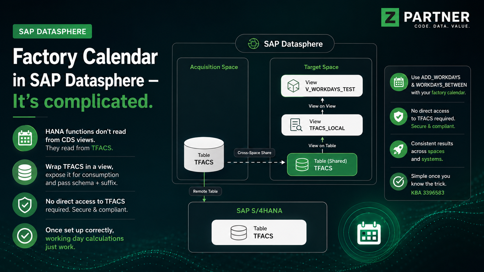
Hi everyone, today we present the last chapter of our SAP Data Warehouse Cloud introduction series.
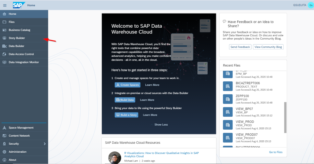
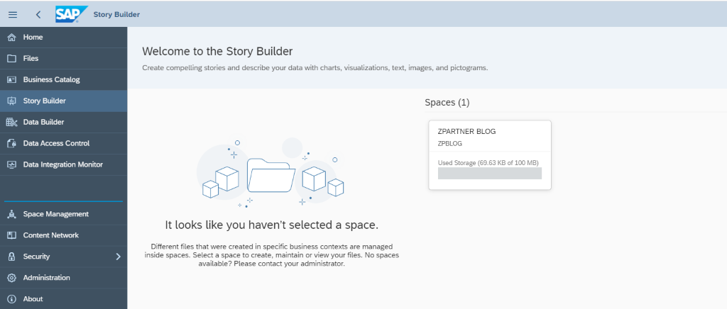
In this chapter, we will learn how to build a story using our created data model. So, let’s start by navigating to the menu story builder (see Fig 1 on the left panel).
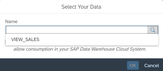
Click on our space which showed up (Fig 2).
Maybe you remember from chapter 2, we named our analytical view VIEW_SALES, therefore only this view is available and can be used for our story.
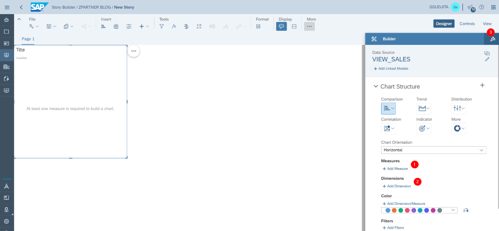
The middle screen is showing our canvas where we can put all elements like charts, images, texts, etc.
On the right panel, you can choose a variety of available charts. Depending on the chart you have to select the measures and the dimensions you need (2). In the styling tab (3) you have the option to change the fonts style, fonts color and some other properties like adding some borders, etc.
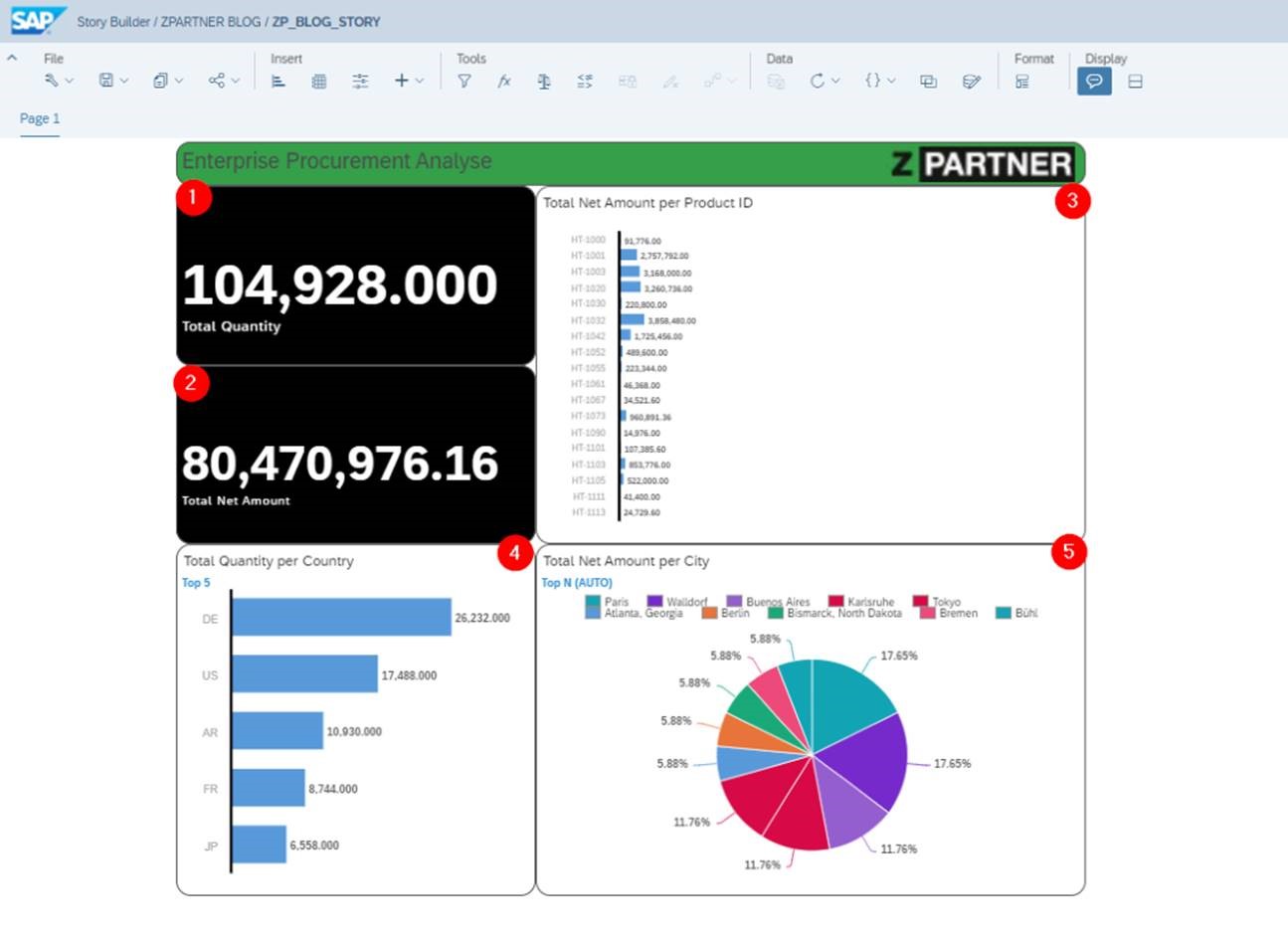
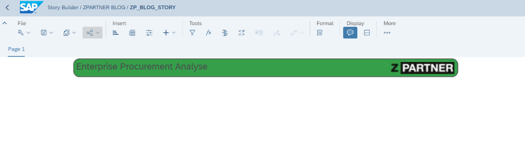
First, we will create our header and logo. In the tab menu insert, you can click + button and give it a title for example “Enterprise Procurement Analyse” and insert a logo
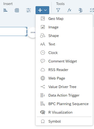
Fig. 5
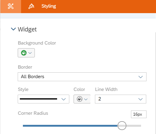
In the styling tab, set the Border to have All Borders, Line Width is used to set the thickness of the border’s line, and Corner Radius is to show some corner effect.
After you have finished you can insert your logo and drag it to the desired position.
The remaining place in our dashboard will be filled with 5 different charts, and on each chart, you can define different styles like border-radius, font style, or color.
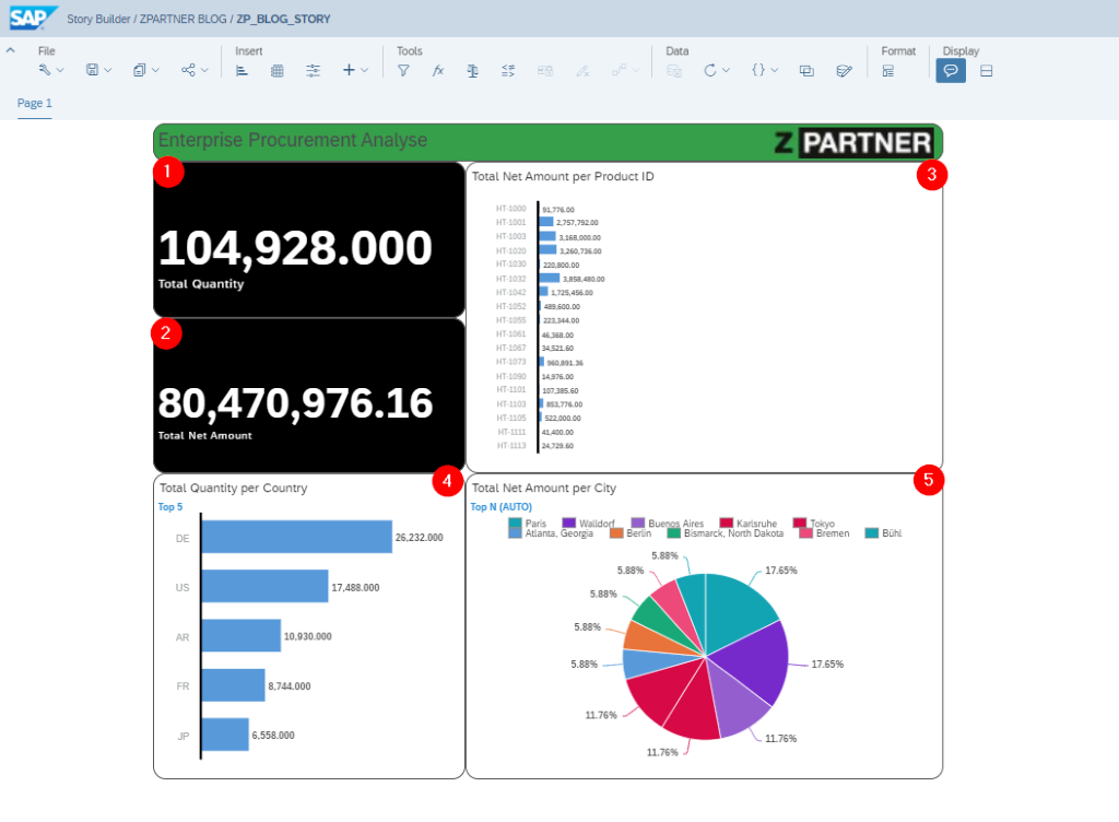
(1). This chart is to measure the total quantity of products that we sold. This chart has a type of numeric point
(2). This chart is to measure the total net amount of products that we sold. This chart has a type of numeric point

(3). This chart is based on type bar/column
and shows the total net amount from each product ID, the measure total net amount and dimension EMP_PRID for product ID are needed.
(4). This chart is based on type bar/column

and showing the top 5 quantity based on country, measure from total quantity and dimension EMP_CNTRY for country are needed.
(5). The last chart is based on a pie chart

and it shows us the total net amount of each city in percentage.
After building your charts, don’t forget to save your story and give it a name.
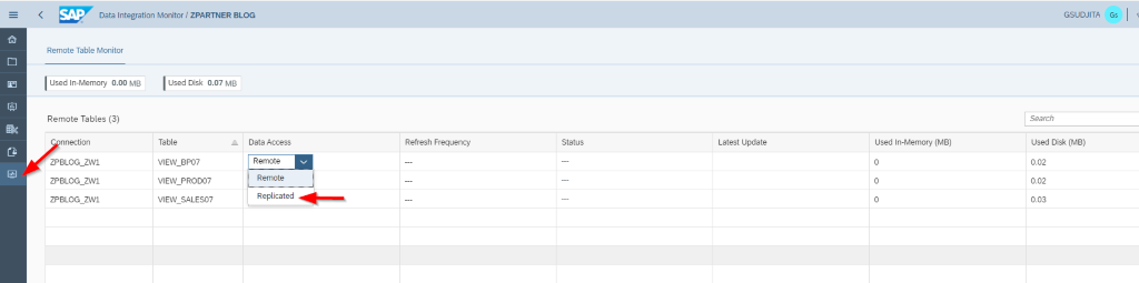
Last but not least, we need to set up the data replication via data integration monitor, so that data is always updated automatically from the sources in our dashboard. On the left panel (Fig 9), you see the menu data integration monitor. After you clicked on it, the sources that we use are listed, change the data access into “replicated” and it will automatically show the current data from the source.
I’m really happy to have accompanied you through our data warehouse cloud blog series. Now you are able to build a data model and a story by yourself. I hope you enjoyed reading this blog.
Next, we will be back to give you some special topics related to SAP Data Warehouse Cloud. Stay tuned and keep safe.
Click here to see the previous blogs:
Part 3: https://www.zpartner.eu/into-the-world-of-sap-data-warehouse-cloud-series-part-3/
Part 2: https://www.zpartner.eu/into-the-world-of-sap-datawarehouse-cloud-series-part-2/
Part 1: https://www.zpartner.eu/how-sap-data-warehouse-clouddwc-consumes-sap-hana-calculation-views/