Harnessing Reporting Potential, by Thinking outside of the Box – Part 1/3 SAC Jump & Run Blog series
Solving Reporting needs in SAP Analytics Cloud by passing limitations with workaround
After years of experience within the area of SAC reporting, I cannot count how often I heard colleagues, business partners, or customers complain about SAC limitations which eventually hinder the reporting potential. Like every software, the limitations in SAC stem from focus in a certain area which will result in the underdevelopment of another area. While this statement is partly true, it has shown that almost every obstacle can be overcome by thinking outside the box. Instead of being frustrated about the straight path which is blocked, users find creative tricks and workarounds and share them with the community. To prove my point, I have created a Jump & Run demo in SAC! Although such games are not part of the tool’s scope, the implementation was still easy, if one is willing to make some compromises.
Part 1 – the Game
Let me introduce you to my demo, which I will use to explain how I was able to use the potential of SAC to my advantage and discuss certain features which helped me to do so:
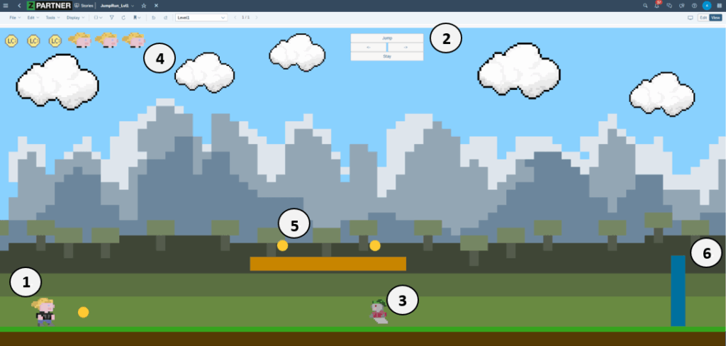
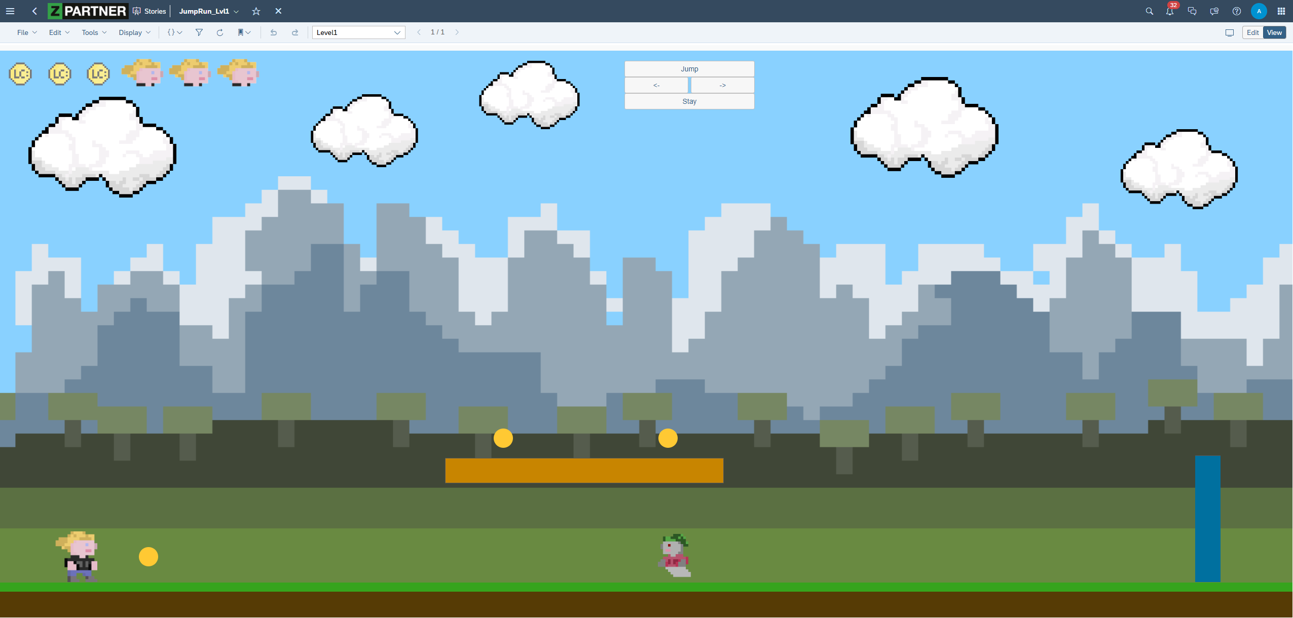
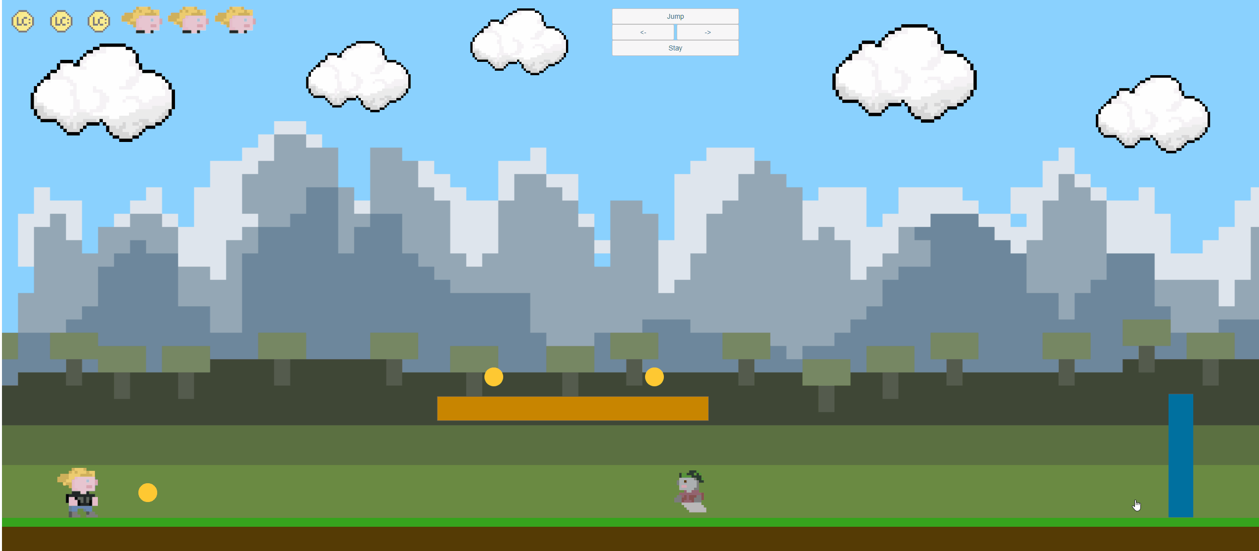
The demo I have created is a playable, though not very complex, jump & run game. It allows the player to control their character (1) by using buttons (2). These buttons trigger the character to automatically run in two different directions, jump, or stay still. Throughout the game, a moving enemy (3) creates constant tension, as it can cost the player valuable lives (4). The player is expected to use platforms in order to collect coins (5). Once all coins are collected, the level is completed by reaching the portal (6).
The most important features, which were not only helpful in creating this game, but also in fulfilling reporting requirements, are the following:
- Panels
- Scripting, especially Events & Timer
- Images & Animations
In this blog series, I will discuss all mentioned features and explain why all of them are powerful tools for responsive reporting and, additionally, helpful when creating a jump & run game. The first blog will focus on Panels.
Part 2 – Panels & the responsive (play-)world
Why “everything” should be in a panel
What are panels?
Panels are containers used to organize and group objects by placing them inside. What makes them such a powerful tool for responsive dashboards is the relative positioning and sizing of these objects. This means that objects are set in a proportional ratio to each other and the panel, which makes the whole group automatically responsive.
Dashboards are often supposed to work on various devices and screen sizes, such as conference room screens, desktops, tablets, or phones. Responsive stories in combination with nested panels are a crucial factor for achieving the desired adaptability. Hence, they should provide the whole structure of the dashboard. As mentioned before, every part can be put in relation to each other, except the highest layer of panels. They provide the overall structure and require a fixed number of columns or rows in the grid system. In responsive stories this step can be handled rather easily, as the lanes of a story can be configured based on the end-device. The SAC user interface allows to adjust how much of the grid every lane can use. Another useful feature of responsive stories is the automatic transformation of components, such as charts and filters. They will show up in their mobile form, when the dashboard is opened on a mobile device. Even outside of responsive stories, panels are a powerful tool for structuring and grouping.
Note: Although a panel’s official unit weight is 0.1 according to “Best Practices for Performance Optimization in Story Design”, they do not impact story performance.
How Panels were used in the Jump & Run
Before diving into the application of panels in the classic reporting sense, I will explain how they were used in the Jump & Run. Note that the game was only developed for desktop and has not yet been adapted for mobile devices.
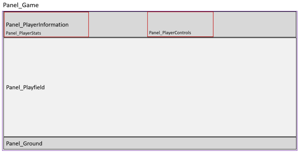
Applying the logic described above, the whole content of the game is nested in one panel. This “outer panel” (Panel_Game) is only used to provide structure and does not directly contain any visible elements. Within this panel are three other panels, referred to as “inner panels” (Panel_PlayerInformation, Panel_Playfield, Panel_Ground) which provide structure for the game and include visible content. One panel represents the header, containing information about the player status and the controls. The middle panel includes the playable world in which the player can move, and one panel is used for the ground. All inner panels are responsive and adapt to changes in the outer panel.
Inside these panels are panels which are supposed to fulfil a specific task. As shown by the fields outlined in red, one panel provides images of the collected coins and remaining lives, while the other includes the control panel which allows to move the player. Similar to the other panels, these are responsive as well and only require rework when the screen size falls below a certain value. In addition, it makes rearranging specific parts, such as the controls, fairly easy. As all necessary parts are grouped within the panel, they can be rearranged with one „click“ without altering the proportions.
Panels in responsive Reporting
Checking the latest updates on the phone while waiting for the next flight to catch, diving into details from the desktop, or discussing current trends with others by accessing the data on a tablet. These and many others are typical examples of use from dashboards. By using responsive stories, lanes, and panels, modern dashboards can be created which can cover these applications.
Achieving this level of responsiveness can be challenging and requires creative conceptualisation. One key component is what I call “Tiles” in this blog. They are a specific way of using panels to structure responsive layouts. While they can differ in size, form, and nested objects, they all follow a common structure. This allows them to be replaces easily with other tiles.
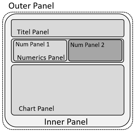

The basic structure was already looked at in the paragraph above, however, I will now shed light on how to structure them for effective reporting. As known already, an invisible outer panel provides the overall positioning and sizing in the grid and lanes. The inner panel adds a visible structure, such as background colour and borders. Nested in there are panels which contain specific elements. In the example provided, I used a title/text, created an area for numeric charts, which again is split in two separate parts with their own subpanels, and left space for a big chart with visualisations. Using this approach results in a fully responsive tile which could look similar to the last figure I provided (Figure 5). It is important to note that all panel and chart positions and size properties are expressed as a percentage of their parent elements, except for the font-size of the title.
Outlook
In the next part of this blog, I will discuss the scripting behind the game, the utilization of global variables, functions, events and especially timer to make the panels and images playable.
Author: Adrian Karl
Adrian is an experienced Business Intelligence Consultant with a strong focus on reporting and data visualization, particularly within the SAP Analytics Cloud (SAC). He specializes in designing and conceptualizing intuitive, business-aligned reporting solutions that drive transparency, enable informed decision-making, and support strategic objectives across departments. Adrian bridges the gap between business requirements and technical implementation, ensuring reporting architectures are scalable, user-centric, and aligned with governance standards.