Introduction
This How-to Paper provides guidance for an end-user on which settings/changes are necessary to make a new/existing SAP Analytics Cloud Story usable for a mobile device. Being able to access stories and dashboards with a single click on smartphones allows end users an instant view of any business and daily improvement. Especially due to the constant growth of data visualization on mobile devices in the Corona crisis, this visualization option requires special attention given by the high number of potential viewers.
The SAP Analytics Cloud mobile application is developed to serve with the best mobile experience when interacting with SAC business content.
Due to Responsive Layout concepts you need to build your SAC Story just once. The content resizes itself to be suitable for all devices.
Video: SAP Analytics Cloud Mobile Best Practices
Walk through
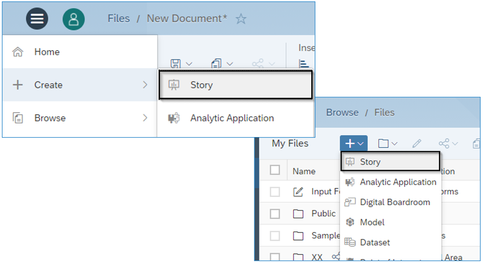
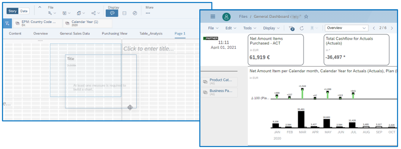
1. Create a new Story / Open existing Story
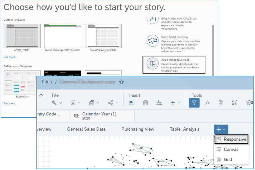
2. Add a Responsive Page to your Story
3. Add charts to your new Responsive Page and choose Measures and Dimensions you would like to visualize
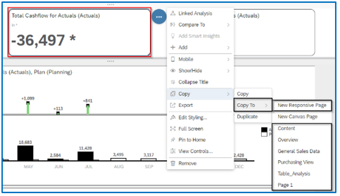
Note: You can migrate or copy existing Widgets from a page to a new/other Responsive Page. You can easily copy and paste multiple tiles between pages by selecting all elements and using ctrl+c to copy and ctrl+v to paste. Alternately, you can also copy and paste using the icon in the menu bar.
Lines are included automatically to a Responsive Page. They are necessary for the content resize, so it gets suitable for any mobile device. These lines manage the layout of the widgets on the different devices, i.e., the widgets within a line stay together. The tiles are displayed sequentially, with the widgets displayed from left to right and from top to bottom. Responsive Layout automatically adjusts the width and height of the tiles, which are proportional to the screen size. Overlapping of the widgets is not allowed. You can add up to 6 lanes in a single row and up to 10 lines in a column. Each lane holds space for 6 possible grid slots.
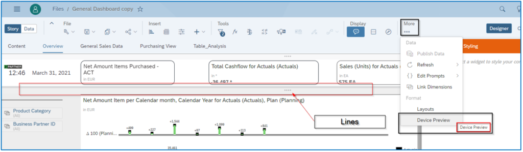
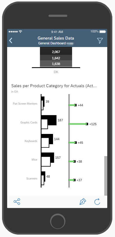
4. Device Preview
Under the menu bar item „More“ a Device Preview can be selected. This is perfect for a quick look at how a dashboard looks on a mobile device and what further changes need to be made. You can preview how the story is displayed on various devices using the Device Preview option.
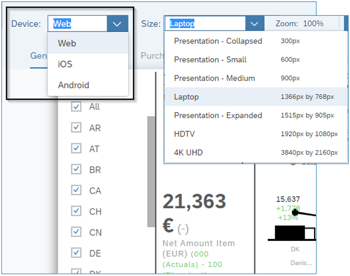
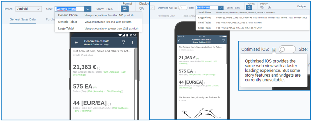
Please use the links for a detailed view on current limitations for iOS devices and for Android devices. Three types of devices are present – Web for large devices, Phone for small devices and Tablet for medium devices.
Conclusion
As you might have already noticed; a story can be easily made suitable for a mobile device in just a few steps. However, this simplicity should not be taken too lightly due to the different technical restrictions that apply to the many different operating devices. First, find out which devices are used by the most users to make the dashboards and reports as user-friendly as possible.
Go to this link for a detailed list of supported features provided by SAP.
Overall, consuming data on mobile devices in-between or on the fly is the future of data consumption. Business processes-decisions need to be made more often and faster. Making SAP Analytics Cloud Stories mobile-ready is becoming increasingly important.
Click here to evaluate if SAP Analytics Cloud is the right tool for you. To learn more about the Analytic Applications of SAP Analytics Cloud, please check out our blog series here.
Source
https://www.youtube.com/watch?v=dpcSf96qbI8&ab_channel=SAPAnalytics