Data Visualization with FIORI and SAC – Part 1
1. Introduction
In the SAP landscape, there are very different platforms and ways to visualize data. In the first part of this series, we will create a Fiori Overview Page based on S/4 data from a virtual CDS data model. In the second one this analytical overview page will be recreated as SAC dashboard as closely as possible, using the same source data model.
Based on this hands-on comparison, we’ll highlight where each tool shines and which scenarios fit better with Fiori or with SAC. The goal is not to declare a winner, but to make the strengths of both approaches clear.
2. Data model
As a data model, we use a custom virtual data model based on CDS view entities, which provides data related to open orders. The View Entity on top of the data model, which serves as our data source, is of type Query, from which a corresponding ODATA service is generated.
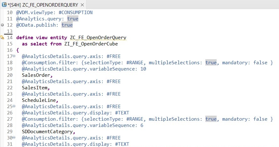
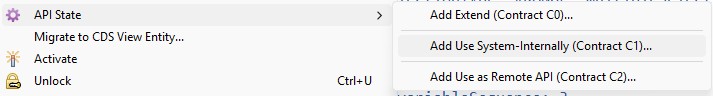
It can therefore also be used directly as a query. However, to make it visible in tools such as AfO or SAC (which will be needed later), it is important to adjust the API status.
3. Creation of Overview Page with the Business Application Studio
An SAP Fiori Overview Page (OVP) is a role-based dashboard that provides a quick, real-time overview of key business information and serves as an entry point for further analysis or actions. It is composed of multiple cards (e.g. analytical, list, or table cards) configured mainly via UI annotations.
As in the past, we use the Business Application Studio to develop the Fiori apps, and once again rely on a template from the Fiori Elements framework. With the generation of the Overview Page a data source must be defined, which will serve as main data model. It should be mentioned that theoretically several data models can be used, but they have to be maintained afterwards by accordingly adjusting the manifest file.
An advantage of these templates, together with the mentioned development environment, is that you don’t necessarily have to write JavaScript yourself to build a functional page. However, the Overview Page differs in complexity from the Fiori Elements apps shown in earlier blogs (Fiori List Report). To create the OVP, knowledge of the application setup and structure in the manifest.json file, and of course a familiarity with the vocabulary of UI annotations is required.
3.1 Annotations
The UI annotations can be defined both in the CDS view entity and locally in the annotation.xml file, or you can combine both. If you define annotations on both sides, for example, to keep certain aspects only local in the UI and not deliver them centrally from the model, you need to be careful about overlaps.
Although the model-driven definition of annotations directly in the service is definitely justified and has its advantages, in this scenario we will define them locally in the UI5 app. I’m doing this to show local annotations in more detail and because the app structure has to be defined locally anyway. This way, the entire definition is in the same environment, which gives me a clear overview and allows me to apply and test changes quickly without being dependent on the backend system.
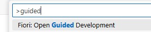
3.2 Guided Development
The Fiori Tools provide a Guided Development, which offers step-by-step tutorial and makes it possible to generate the required code snippets, consisting of the corresponding entries in the manifest.json and the annotation.xml file, based on input from the developer.
It provides these guided support steps for all available card types as well as for other functions:
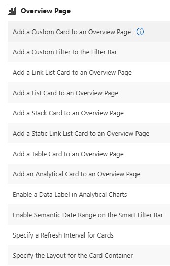
Especially in the beginning when starting to work on Overview Pages I can recommend using the Guided Development to get familiar with the available properties for each card type and how the code is generated in which file.
If you already have a good understanding of the application structure and know which annotations to apply, where, and how, the necessary adjustments can be made very quickly by editing the relevant files manually.
3.3 Card Creation
We will now create five cards (a list card, two analytical chart cards, one table card and a linklist card), which will show data from our data model, which is provided by an OData Service generated out of our CDS View Entity, in different ways across various views.
As already mentioned, the app structure and the card settings are defined in the manifest.json file. To add the definition and layout of the card content, we must link the card with needed annotations which must be defined in the annotations.xml file. For this purpose, the annotationPath property is used. In this example we defined the relevant line item annotations for the first card, the list card, under the qualifier lineitem1:
"sap.ovp": {
"globalFilterModel": "mainModel",
"globalFilterEntityType": "ZC_FE_OPENORDERQUERYType",
"containerLayout": "resizable",
"enableLiveFilter": true,
"considerAnalyticalParameters": false,
"cards": {
"01_Card": {
"template": "sap.ovp.cards.list",
"model": "mainModel",
"settings": {
"listFlavor": "standard",
"listType": "condensed",
"entitySet": "ZC_FE_OPENORDERQUERY",
"title": "{{openAmount}}",
"annotationPath": "com.sap.vocabularies.UI.v1.LineItem#lineitem1",
"identificationAnnotationPath": "com.sap.vocabularies.UI.v1.Identification#ident2",
"sortBy": "OpenAmountDispCurr",
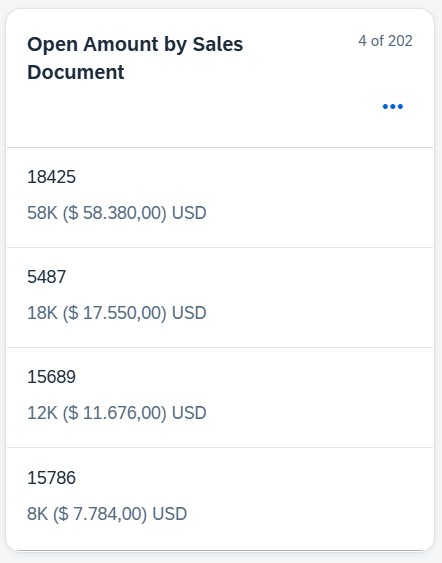
"sortOrder": "descending"The definition of which information from our data model is used in this list card can therefore be seen under this qualifier in the annotation.xml file:
<Annotation Term="UI.LineItem" Qualifier="lineitem1">
                    <Collection>
                        <Record Type="UI.DataField">
                            <PropertyValue Property="Value" Path="SalesOrder" />
                            <Annotation Term="UI.Importance" EnumMember="UI.ImportanceType/High" />
                        </Record>
                        <Record Type="UI.DataField">
                            <PropertyValue Property="Value" Path="OpenAmountDispCurr" />
                            <Annotation Term="UI.Importance" EnumMember="UI.ImportanceType/High" />
                        </Record>
                    </Collection>
                </Annotation>
This definition result in following card layout:
Note: It should be kept in mind that not all cards provide analytical functions, so the data preparation needs to be thought through well in advance. For the desired output in each card, you must ensure that the data model delivers the data at the required level.
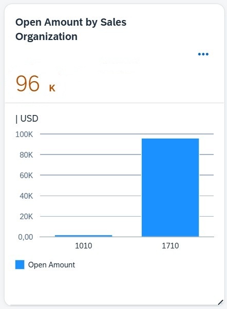
All cards are generated following this pattern; however, depending on the card type, different annotation terms must be applied, which in turn provide different properties. Here are the definitions for the next card, an analytical chard card:
manifest.json:
 "02_Card": {
        "template": "sap.ovp.cards.charts.analytical",
        "model": "mainModel",
        "settings": {
          "dataPointAnnotationPath": "com.sap.vocabularies.UI.v1.DataPoint#dpmg1",
          "chartAnnotationPath": "com.sap.vocabularies.UI.v1.Chart#chart1",
          "entitySet": "ZC_FE_OPENORDERQUERY",
          "title": "{{openAmountSalesOrg}}"
}annotation.xml:
<Annotation Term="UI.Chart" Qualifier="chart1">
                    <Record Type="UI.ChartDefinitionType">
                        <PropertyValue Property="ChartType" EnumMember="UI.ChartType/Column" />
                        <PropertyValue Property="Title" String=" " />
                        <PropertyValue Property="Dimensions">
                            <Collection>
                                <PropertyPath>SalesOrganization</PropertyPath>
                            </Collection>
                        </PropertyValue>
                        <PropertyValue Property="DimensionAttributes">
                            <Collection>
                                <Record Type="UI.ChartDimensionAttributeType">
                                    <PropertyValue Property="Dimension" PropertyPath="SalesOrganization" />
                                    <PropertyValue Property="Role" EnumMember="UI.ChartDimensionRoleType/Category" />
                                </Record>
                            </Collection>
                        </PropertyValue>
                        <PropertyValue Property="Measures">
                            <Collection>
                                <PropertyPath>OpenAmountDispCurr</PropertyPath>
                            </Collection>
                        </PropertyValue>
                        <PropertyValue Property="MeasureAttributes">
                            <Collection>
                                <Record Type="UI.ChartMeasureAttributeType">
                                    <PropertyValue Property="Measure" PropertyPath="OpenAmountDispCurr" />
                                    <PropertyValue Property="Role" EnumMember="UI.ChartMeasureRoleType/Axis1" />
                                </Record>
                            </Collection>
                        </PropertyValue>
                    </Record>
                </Annotation>
According to the definition, the OVP will show the following chart card:
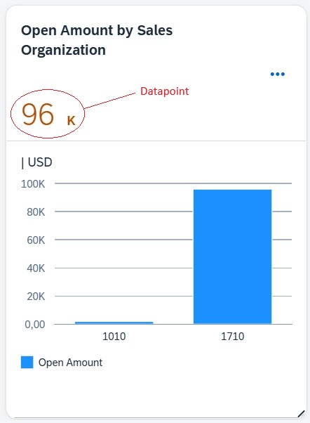
3.3.2 Datapoint
As already mentioned, the different card types come with different settings and can display information in various ways. For example, within an Analytical Chart Card, you can include DataPoints in addition to the chart itself, providing extra information. These DataPoints have their own annotation terms and are therefore maintained separately from the chart annotations in the annotation.xml file. The DataPoints are assigned to the respective cards via their own annotationPath.
annotation.xml:
<Annotation Term="UI.DataPoint" Qualifier="dpmg1">
                    <Record Type="UI.DataPointType">
                        <PropertyValue Property="Criticality" EnumMember="UI.CriticalityType/Critical" />
                        <PropertyValue Property="Value" Path="OpenAmountDispCurr" />
                        <PropertyValue Property="Title" String="{@i18n>openAmount}" />
                    </Record>
</Annotation>manifest.json:
"02_Card": {
        "template": "sap.ovp.cards.charts.analytical",
        "model": "mainModel",
        "settings": {
          "dataPointAnnotationPath": "com.sap.vocabularies.UI.v1.DataPoint#dpmg1",
          "chartAnnotationPath": "com.sap.vocabularies.UI.v1.Chart#chart1",
          "entitySet": "ZC_FE_OPENORDERQUERY",
          "title": "{{openAmountSalesOrg}}"
        }
Following this pattern, we added further cards and completed our OVP:
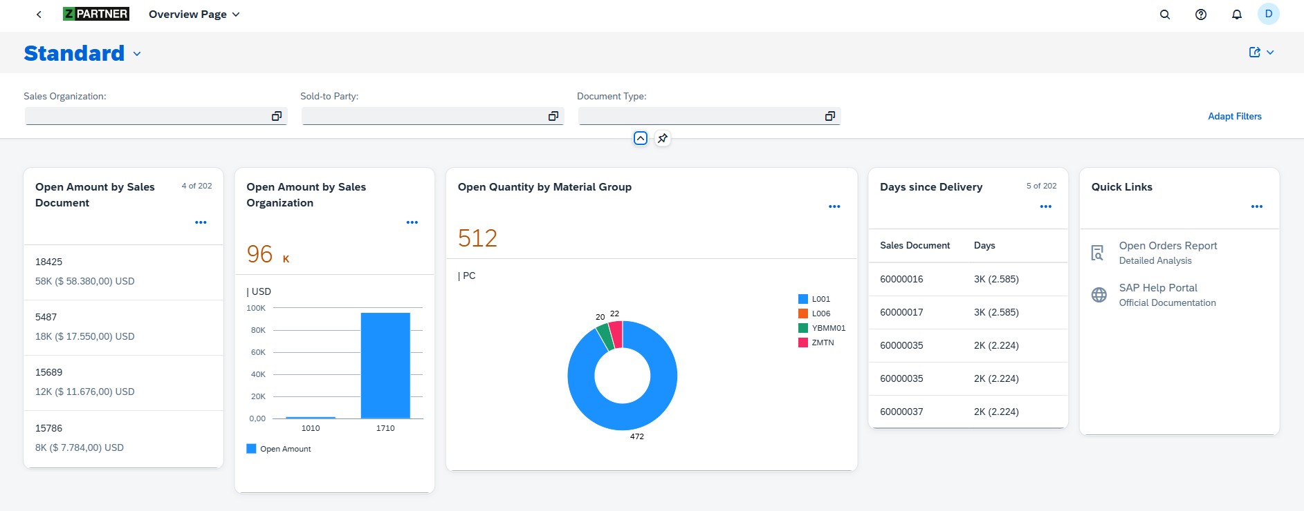
The Overview Page enables users to flexibly rearrange cards via drag-and-drop, resize individual cards, and even hide cards, which noticeably improves the overall user experience. In case of list and table cards, with every size change a refresh is performed and the amount of data which is shown adjusted to the new card size:
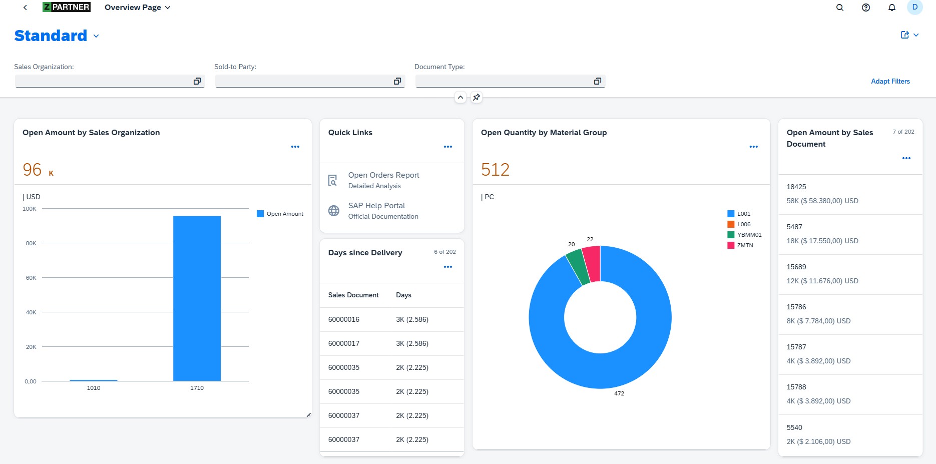
These personalized settings can be reset by the user with just a few clicks.
The last card we added is a Link List Card, containing navigation targets which were defined by using a fixed URL and an intent, consisting of a semantic object and an action leading to the mapped target application. This Fiori specific type of navigation called intent based navigation is covered in the next point.
4. Intent-Based Navigation
In this section, we will look at navigation within the Overview Page, more specifically, the intent-based navigation. An intent, consisting of a semantic object and an action, is assigned to a target application. For common business objects (like Sales Order) there are already several intents available out of the box, each with a corresponding target application. Depending on the target application, corresponding parameters can be passed.
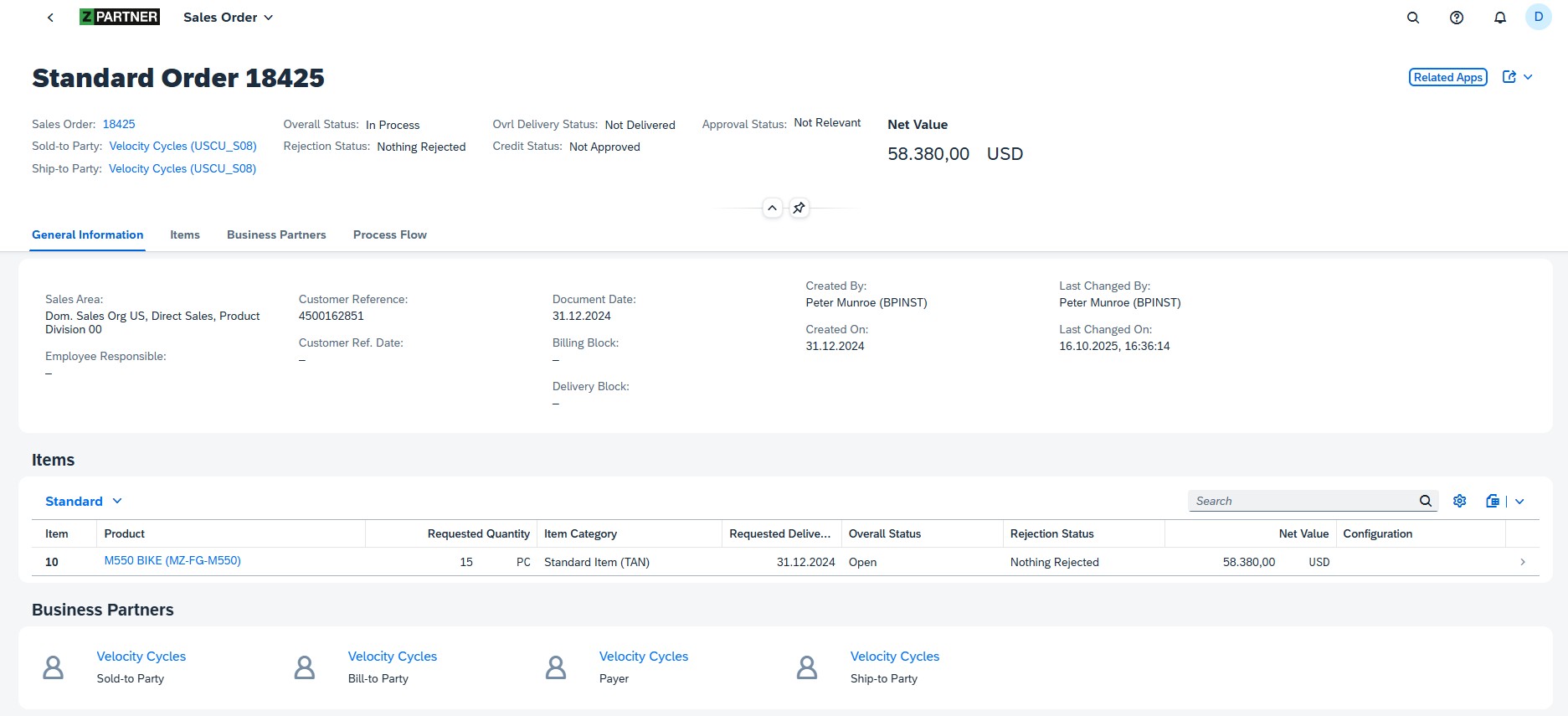
In addition, you can also create custom semantic objects which, together with a corresponding action, are mapped to a user-defined target. In our OVP, we use both scenarios. For example, through the relevant annotations we enabled the entries in the List Card to be clickable and to navigate to a so-called Fact Sheet for the Sales Document. This Fact Sheet is simply an app that provides a view of the most important key information of the Sales Document. Both, this Fact Sheet and the intent mapped to it already exist as standard content. Therefore, to enable the navigation, all we need to ensure is that the relevant field is identified as the respective semantic object and that the corresponding action is set:
<Annotation Term="UI.Identification" Qualifier="ident2">
                    <Collection>
                        <Record Type="UI.DataField">
                            <PropertyValue Property="Label" String="{@i18n>salesorder}" />
                            <PropertyValue Path="SalesOrder" Property="Value" />
                            <Annotation Term="UI.Importance" EnumMember="UI.ImportanceType/High" />
                        </Record>
                        <Record Type="UI.DataFieldForIntentBasedNavigation">
                            <PropertyValue Property="SemanticObject" String="SalesOrder" />
                            <PropertyValue Property="Action" String="displayFactSheet" />
                            <PropertyValue Property="Label" String="{@i18n>displaysalesorderfs}" />
                            <Annotation Term="UI.Importance" EnumMember="UI.ImportanceType/High" />
                        </Record>
                    </Collection>
                </Annotation>
These settings are linked to the respective Card in the Overview Page by the identificationAnnotationPath:
"01_Card": {
        "template": "sap.ovp.cards.list",
        "model": "mainModel",
        "settings": {
          "listFlavor": "standard",
          "listType": "condensed",
          "entitySet": "ZC_FE_OPENORDERQUERY",
          "title": "{{openAmount}}",
          "annotationPath": "com.sap.vocabularies.UI.v1.LineItem#lineitem1",
          "identificationAnnotationPath": "com.sap.vocabularies.UI.v1.Identification#ident2",
          "sortBy": "OpenAmountDispCurr",
          "sortOrder": "descending"
        }
The shown definition ensures that the Fact Sheet for the respective Sales Document is opened by clicking on an entry in the List Card:
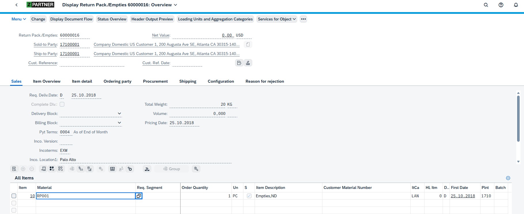
For the table card I defined other identification Annotations which use the same semantic object with the action “display”, which will open the selected Sales Order (transaction VA03) in the HTML Gui:
For the first entry in the link list card, which leads to an Open Order query where the user can make more detailed analysis, I defined a custom semantic object and created the needed target mappings (shown in previous blogs like analytical Fiori apps) to enable the call of the needed query in the appropriate standard Web Dynpro application. For this navigation via the link in the Linklist Card, it is sufficient to directly adjust the card settings in the manifest.json file:
"05_Card": {
        "template": "sap.ovp.cards.linklist",
        "settings": {
          "listFlavor": "standard",
          "staticContent": [
            {
              "title": "Open Orders Report",
              "subTitle": "Detailed Analysis",
              "imageUri": "sap-icon://detail-view",
              "semanticObject": "ZPOPENORDER",
              "action": "analyze"
            },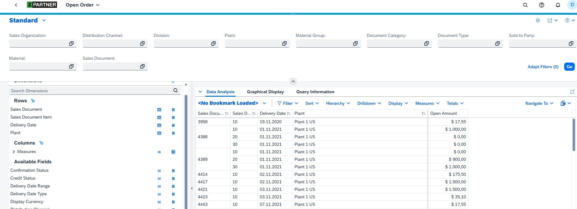
The use of this type of navigation allows a smooth navigation back to the original page.
5. Filter
You can set a filter on any of the fields provided by the data model, but we want to implement a suitable filter bar which contains those fields which are most commonly used:

This filter bar is shown above the OVP and implemented by a just defining a few annotations:
<Annotation Term="UI.SelectionFields">
                    <Collection>
                        <PropertyPath>SalesOrganization</PropertyPath>
                        <PropertyPath>SoldToParty</PropertyPath>
                        <PropertyPath>SalesDocumentType</PropertyPath>
                    </Collection>
                </Annotation>
The selected filter values apply to all of the Overview Page’s cards.
Conclusion and Outlook
The Fiori Overview Page proves to be a strong choice when you want to offer business users a role-based analytical dashboard that bundles key figures and different data perspectives close together in one space, and from there serves as an entry point into other analytical or operational applications. The users benefit from a guided, flexible and intuitive user experience. Another advantage is the intent-based navigation, which enables smooth, consistent drill-downs into standard or custom target apps, making cross-app journeys feel natural rather than fragmented. At the same time, it’s important to note that building such an OVP is not a purely customizing task. You need a development environment and the corresponding know-how in annotations, and UI configuration to create a robust, tailored dashboard. With that foundation and its benefits in mind, the next part of this series will attempt to recreate the same dashboard in SAP Analytics Cloud and then compare the SAC version directly with the Fiori Overview Page.
Related Blogs
Author: Denis Vukovic
Denis is an SAP professional with nearly 15 years of experience in SAP Analytics. He has deep analytics expertise in both CDS-based scenarios in SAP S/4HANA and in classic SAP BW. In addition, he focuses on SAP Fiori and SAPUI5 development and regularly publishes blogs on these topics, especially in combination with virtual data models built in CDS.