A first attempt with OpenAI Astra on our internal SAC tenant
I asked Astra to build a sales dashboard directly in our internal SAP Analytics Cloud tenant. It produced a saved SAC Story with three KPI tiles, five charts, interactive filters, scripting, dynamic scaling and contextual help.
This first attempt also revealed weaknesses in how I used Astra and what should be done to get a better result.
The starting point
I used Astra in Codex with browser control. Two SAC tabs were open: SAP’s Sales_SampleModel and the folder intended for the new objects that will be created. The agent could inspect the model, create the Story and configure it through the SAC interface.
My prompt was ambitious and a wild mix of features and demands. It asked for an executive sales dashboard, IBCS conventions, scripted interactions, help texts for each chart and layouts from mobile devices up to 4K. I had not prepared a SAC-specific skill explaining the relevant features, our design standards or how I wanted reusable components to be built at all. Also there were no templates at all in our SAC tenant (where the AI got access) that could have been used as a reference.
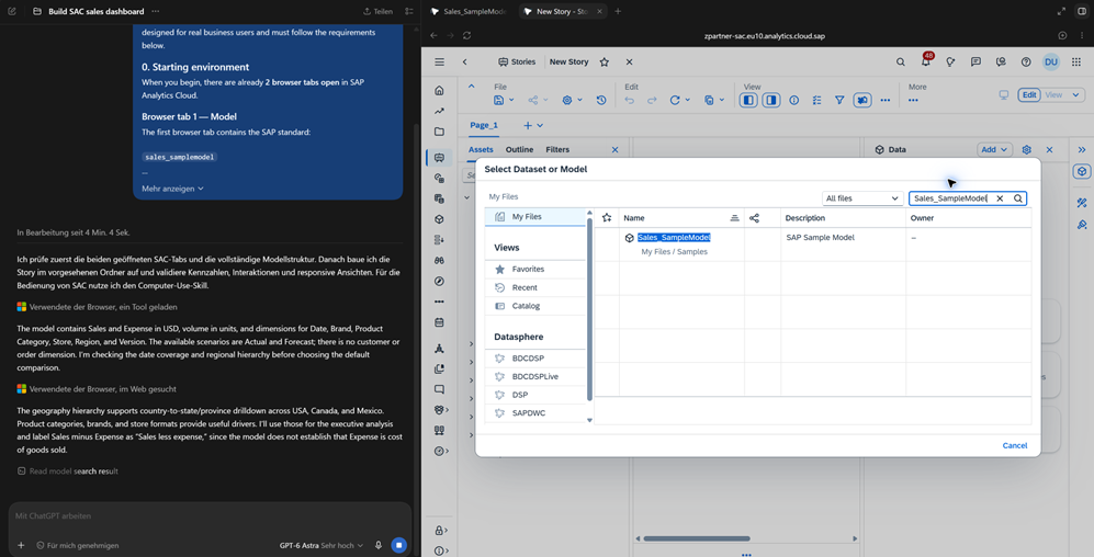
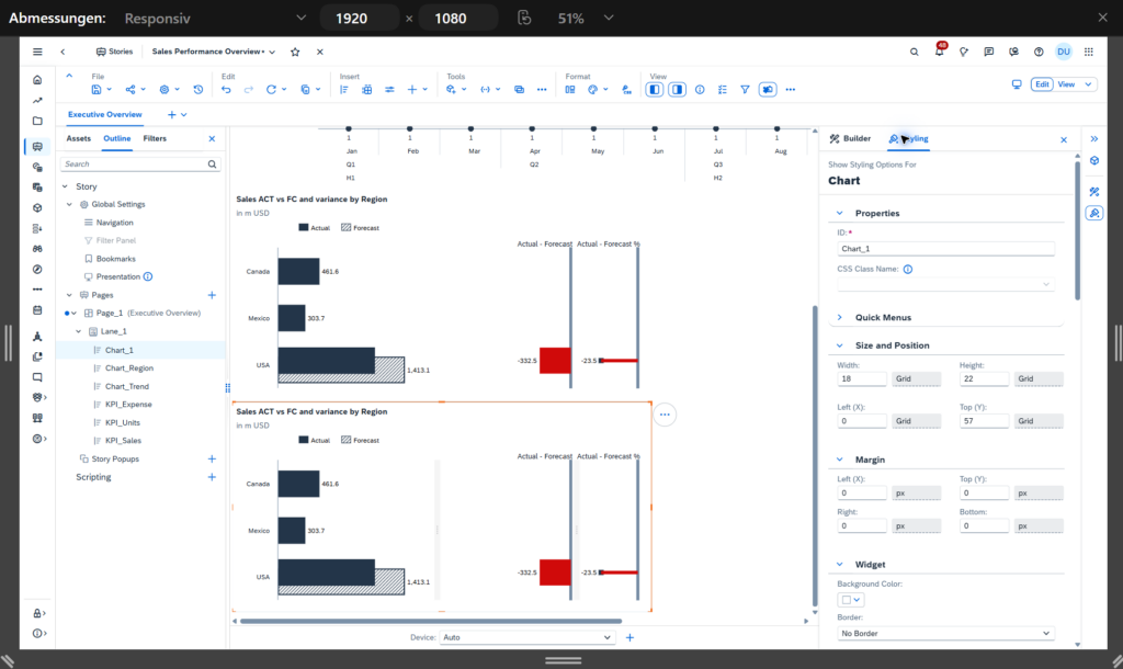
Figure 1. The build session in Codex and SAC. Astra inspected the model before configuring the Story.
The interesting parts of the process
One of the most useful parts of the experiment was watching the comparison change. The early version Astra created showed 2026 Sales of USD 1,845.9 million against Forecast of USD 1,413.1 million. That produced a positive variance of 30.6%, which Astra initially described as meaningful.
The regional view exposed the problem. Actual data covered the USA, Canada and Mexico, while the Forecast in that comparison was only populated for the USA. The headline therefore compared totals with different geographical coverage. The arithmetic was correct, but the percentage could easily suggest a level of sales outperformance that the data did not establish.
During validation, Astra checked the booked data and switched the dashboard to 2026 Actual versus 2025 Actual. Sales growth then became USD 167.8 million, or 10.0%. Catching and correcting that was valuable. So was seeing how confidently the earlier comparison had been presented. I would make coverage checks an explicit step before building the first KPI next time. Notably, Astra performed this check and the resulting change of the comparison entirely on its own without any human interaction.
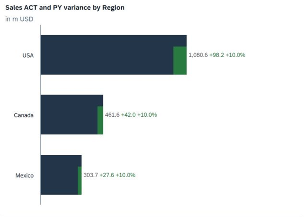
Figure 2. The saved country comparison after switching to previous-year Actuals. All three countries now use the same comparison period.
The final Sales Performance Overview uses Sales, Volume and Expense as its headline KPIs. Below them sit a quarterly sales trend and ranked views by Region, Product Category, Store Format and Brand. The reporting context explicitly says full-year 2026 versus 2025; this is a sample-data comparison, not a live year-to-date report.
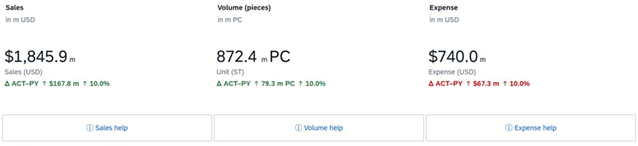
Figure 3. The final KPI area. Higher sales and volume are green; higher expense is red. The screenshot also shows the generous spacing and large help controls that I would revisit.
The interactions took more work. An early version cleared active filters when the user moved away from a chart selection. The final behaviour preserves selections until they are changed or reset. In the recorded tests, selecting Canada changed Sales to USD 461.6 million. Adding Deluxe Supermarket and Food narrowed that to USD 158.0 million. Reset restored the full totals and the default drill levels. This also was noticed and corrected by Astra completely on its own.
Each KPI and chart also has a help button explaining its definition, comparison logic, and interaction. A shared popup serves all eight topics. Getting that working required a correction to how the popup received its text; Astra handled that on its own as well. Choosing a responsive Story did not finish the mobile work. During the build, narrow layouts produced horizontal scrolling and cramped time labels. Astra added device-specific layouts, enlarged controls and changed the default trend from twelve months to four quarters, with monthly drill-down available.
The phone screenshots below show the result on an Android device. The charts remain readable in a vertical flow and the help popup opens. They also show the trade-off: the page is long, the help buttons occupy considerable space, and the popup contains a lot of text. I would shorten the explanations and review the order in which a phone user encounters the KPIs and analyses.
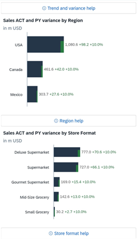 | 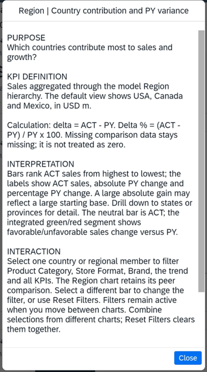 |
Figure 4. Android views of the dashboard and its regional help. These captures show the mobile presentation; they are not a full device or usability test.
Desktop, tablet and phone previews were part of the build, as was a separate font adjustment for 4K. I would still test the intended devices with users before rollout. A layout fitting on a screen is only one part of that check.
The missing composites
The Story uses no SAC Composites. There is reuse inside it through shared filtering logic and the common help popup, but the run did not produce reusable header or KPI objects for other Stories.
SAP describes composites as reusable combinations of widgets and scripting elements. For a series of dashboards, I would assess a common header, KPI pattern and help component as candidates. The value would be maintaining those patterns across Stories. Composites would not automatically solve the layout or analytical issues seen here.
My prompt mentioned composites repeatedly, but qualified their use with phrases such as „where appropriate.“ It also told Astra to avoid unnecessary objects. I left an important architecture decision open. If demonstrating reuse was part of the experiment, I should have named a specific component and then checked how it was reused.
What I would give Astra next time
The prompt was long, but it was not a particularly good handover. Calling the agent a SAC expert did not give it our project conventions. It had the task and access to the model, but no prepared guidance about our tenant or the way we develop dashboards, nor had Astra any context on how a good SAC dashboard looks technically.
For a second run, I would prepare a short SAC skill: a reusable set of instructions with examples that the agent can consult during the build. I would include the following:
- A reference Story and a defined reusable component, including when to use Composites and how their events and filters should work.
- Model definitions and comparison checks, especially scenario coverage, time periods, units and the business meaning of key figures.
- A few supported scripting patterns for persistent filters, reset behaviour and shared help, with examples from our SAC environment.
- Concrete acceptance checks for calculations, mobile reading order, chart labels and reuse in another Story.
I would then review one KPI and one interactive chart before letting the agent expand the pattern. That should make misunderstandings easier to spot. Whether it reduces rework is something a second run would need to demonstrate.
Also, I would still review the visual result with a reporting specialist. A native IBCS palette and variance charts are useful starting points; they do not establish that the finished Story is IBCS-compliant. Label consistency, information density and the reading flow need their own review.
Conclusion
My first attempt with Astra produced something substantial: a working SAC Story created through the SAC interface, including scripting, responsive layouts, interactive filtering, contextual help, and several autonomous corrections during testing.
But the more important result was not the Story itself.
It was understanding what the agent was missing.
The limiting factor was not simply whether Astra knew how to click through SAC.
It was whether Astra had enough context to understand how we wanted the dashboard to be engineered, validated, and designed.
That distinction matters.
If I run the experiment again, I would spend less effort writing one enormous prompt and more effort giving the agent reusable SAC knowledge: reference implementations, semantic definitions, supported patterns, and explicit acceptance tests.
Because an AI agent can build a dashboard.
But if we want it to build a good dashboard, it needs to know much more than where the buttons are.
The finished Story
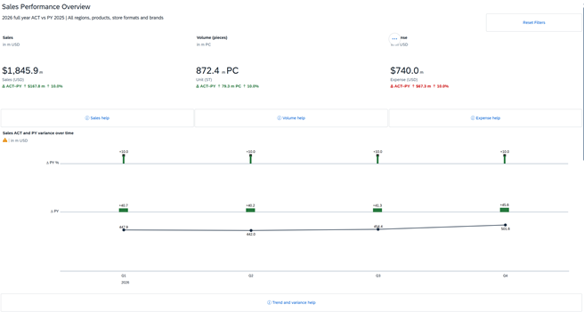
The Sales Performance Overview: headline KPIs and the quarterly sales trend.
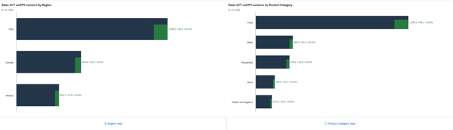
Ranked views by Region and by Product Category.
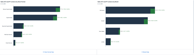
Ranked views by Store Format and by Brand.